
Layering Stickers, Washi Tape, and Ephemera Without Cluttering Your Pages
A practical method for combining stickers, washi tape, and ephemera so journal pages stay readable: plan the text first, cluster instead of sprinkle, and edit before you close the book.
There is a moment, usually around the third or fourth spread, when a journal stops looking like a record of your days and starts looking like the bottom of a stationery drawer. A ticket stub here, a strip of floral washi there, three stickers because they were too pretty to leave in the packet. None of it is wrong, exactly. It has simply stopped leaving room for the thing the notebook was for.
Cluttering rarely happens in one dramatic decision. It happens in small, reasonable ones. The good news is that layering well is a method rather than a gift, and the method is mostly about deciding what to leave out.
Map the Page Before You Stick Anything
Before any tape comes off the roll, decide where the words go. Most cluttered pages begin with decoration and end with writing squeezed into whatever is left — a narrow corridor down the middle, four lines jammed against the gutter. Write first when you can. If you like to decorate first because it gets you started, at least pencil a faint boundary: a light rectangle, or a single vertical line marking where the text block will sit.
A simple structure works on nearly any page size. Divide the spread into three zones:
- The reading zone. Roughly half to two-thirds of the page, kept clear of anything that sits on top of handwriting.
- The focal zone. One corner or one edge where the decoration lives, near the text but not over it.
- The quiet margin. A strip along the outer edge or the bottom that stays empty. Empty isn't wasted; it's what makes the busy part look intentional.
Leave the gutter alone. Anything bulky near the spine fights the binding and makes the notebook awkward to write in later.
One Cluster Beats Ten Small Touches
The biggest single cause of visual clutter is even distribution. Scatter ten small stickers across a page and the eye has nowhere to rest; the page reads as texture, like static. Gather the same ten elements into one corner and the page suddenly has a composition.
Think of a cluster as three layers:
- A base — a larger piece of ephemera, a photo, a die-cut, a torn strip of opaque washi establishing a shape.
- A middle — a sticker, label, or ticket overlapping the base's edge.
- A top — one small accent: a date stamp, a tiny sticker, a narrow ribbon of tape.
Build one cluster per page, or two if they sit on opposite corners and clearly differ in size. On a two-page spread, treat both pages as one surface: a cluster on the left and one on the right, anchored along the same horizontal line, feel far calmer than two floating at different heights.
Vary the Size, Guard the Gaps
A page where every element is roughly the same size has no hierarchy. Mix one large element with two medium and three or four small ones, and the eye knows where to start.
Then protect the gaps. Leave roughly a thumb-width of bare paper around each cluster. It sounds like a small thing; it changes everything. A cluster pushed against the page edge or against a line of handwriting reads as cramped, and decoration touching text pulls attention away from the sentence.
Keep to a small palette
Choose three colours plus neutrals — kraft brown, cream, black, white — and stay there for the whole notebook. One dominant colour, two accents. Patterns obey the same logic: one busy pattern per page, everything else subdued, or the spread turns into a scrap of wrapping paper.
Decide the focal point
Choose what the eye should land on first and don't compete with it. A bold sticker, a bright washi block, and a glossy photo on one page means none of them wins. Cover two for a moment and see which one you would keep.
Not Every Material Plays Well Together
- Flat matte layers well. Matte stickers and paper tape make good bases; puffy, glossy, or raised stickers belong on top, because they add height you can't write over.
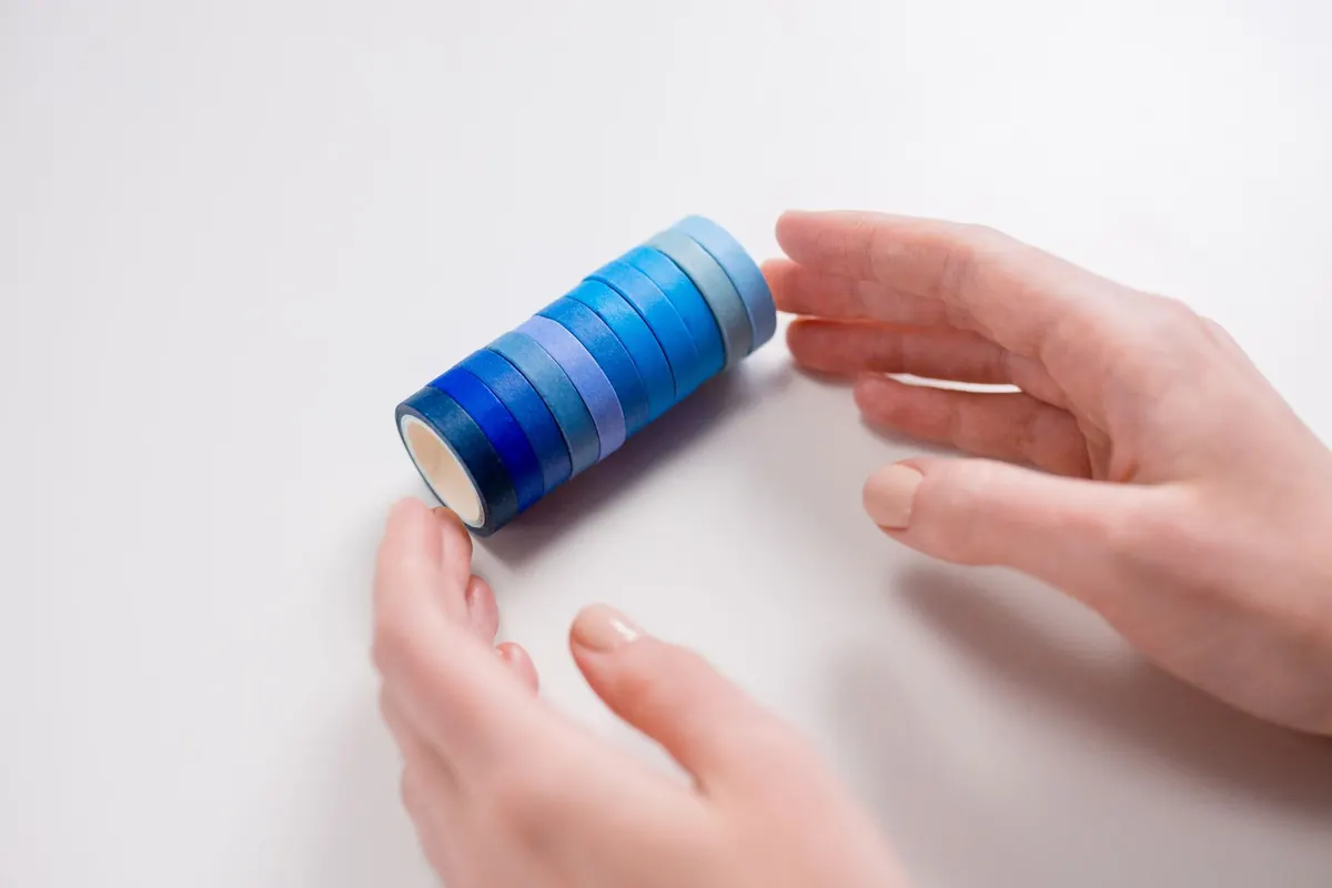
- Translucent washi is forgiving. It lets the paper beneath show, so it crosses writing gracefully. Opaque tape creates a hard edge — useful for blocking a shape, less useful for subtlety.
- Thickness matters. Receipts, tickets, and pressed leaves create bumps that stop a pen mid-word. Trim to the interesting part, or copy the sentimental pieces and paste the copy. A few seconds with small scissors solves most of it.
- Stick thoughtfully. A tape runner or glue stick applied near the edges holds flat layers without wrinkling. Keep heavy layers away from the spine. Thermal receipts fade with heat and time, so copy any you want to keep readable.
- Test your pen. Some inks skip over coated sticker surfaces. Write on the corner of a spare sticker first rather than discovering it mid-sentence.
A Repeatable Sequence
- Block out the text. Write the entry, or draw a light pencil box where it will go.
- Lay the big pieces down dry, without sticking. Shift them for a minute, then step back and look from arm's length. Photograph an arrangement you like before you commit.
- Stick the base first, positioned in the focal zone.
- Overlap on purpose. Let a sticker cross the edge of a paper scrap rather than sit inside it; overlapping edges are what make layers read as layers.
- Tuck rather than paste. Slip ephemera under the corner of a tape strip on one side only, leaving the other edge free. It sits flatter and looks less glued down.
- Trim the bulk. Cut away the blank half of a ticket, the white border of a sticker sheet, the part of the leaflet you don't need.
- Check at arm's length before you close the book. If your eye finds the decoration and loses the writing, remove one element.
Rescue a Page That Went Too Far
Even with a method, some spreads get away from you. You don't have to abandon them.
- Remove. Stickers lift more easily than you expect if you warm them slightly with a fingertip and peel slowly. Washi comes up cleanly from smooth paper and less cleanly from torn edges — which is fine, since a torn edge is a look.
- Cover and reclaim. A rectangle of cream paper or a plain label over the busiest corner gives the writing somewhere to go, and the patch reads as deliberate layering.
- Add quiet. If the page is dense everywhere, place one large plain shape — a kraft tag, a blank label — over the middle of the noise. A single calm area rebalances the whole page.
Then write on it, even if only a date and one line. A dated, imperfect page tells you more about your month than a flawless one does.
The Check Before You Close the Book
Three questions, ten seconds. Can I find the writing? Does my eye land on one thing? Will I still be able to read this in a year? If any answer is no, take off one element. Nine times out of ten, subtraction is the fix rather than addition.
Keep a few spreads deliberately bare. A page with only handwriting and a date works as a palate cleanser, and it makes the decorated pages look more considered by contrast. When a spread does work, photograph it and note in the back of the notebook what you did — the palette, where the cluster sat, the order of the layers. That becomes your own reference library, built one page at a time.
Photo: Ron Lach / Pexels